In the ever-evolving landscape of marketing, where every detail can impact consumer decisions, the role of color cannot be overstated. Colors have the extraordinary ability to evoke emotions, shape perceptions, and influence behavior. When it comes to print marketing, choosing the right colors is a strategic decision that can either elevate or undermine a campaign. To craft effective marketing materials, it’s essential to delve into the psychology of color and understand how it impacts your target audience.
The Profound Impact of Color on Emotions
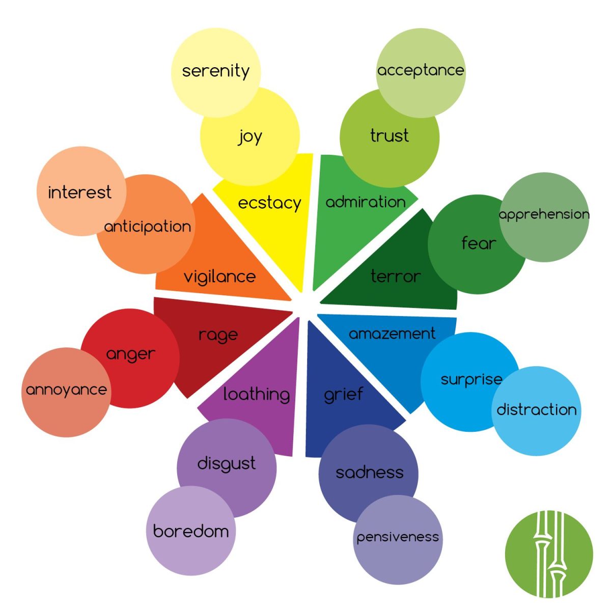
Colors possess the remarkable capability to elicit specific emotions and moods. Here’s a comprehensive look at some common colors and the emotions they tend to evoke:
- Red: The color red is synonymous with passion, excitement, and urgency. It can stimulate appetite, making it a prevalent choice in the food industry. In print marketing, red can effortlessly grab attention and convey a sense of urgency, rendering it ideal for limited-time offers and sales promotions. It’s also associated with love, making it suitable for romantic-themed campaigns. Furthermore, red is known to increase heart rate and create a sense of urgency, which is why it’s often used for clearance sales and call-to-action buttons.
- Blue: Blue is known for its calming and trustworthy qualities. It symbolizes professionalism, reliability, and security. Many financial institutions and tech companies opt for blue in their branding to convey trustworthiness and stability. It has the power to create a sense of serenity, making it a popular choice for healthcare and wellness-related marketing. Lighter shades of blue can promote a sense of tranquility and openness, while darker blues exude professionalism and reliability.
- Green: The color green is intrinsically linked to nature, growth, and health. It signifies freshness and renewal and is often used to promote eco-friendly products or convey a sense of well-being. The organic and sustainable industries frequently harness green to connect with environmentally conscious consumers. Lighter shades of green are often associated with health and tranquility, while darker greens may evoke wealth and luxury. It’s important to note that the specific shade of green can significantly impact the message conveyed.
- Yellow: Yellow is associated with optimism, happiness, and warmth. It can draw attention and is often used to highlight crucial information or call-to-action buttons. In the marketing world, yellow is frequently employed to create a friendly and approachable image. Yellow can evoke feelings of joy and positivity, making it an ideal choice for brands seeking to create an inviting atmosphere. However, it’s crucial to use yellow sparingly, as excessive use may cause anxiety or strain on the eyes.
- Purple: Purple is the color of luxury, royalty, and creativity. It exudes elegance and sophistication, making it an excellent choice for high-end brands aiming to convey exclusivity and quality. Lighter shades of purple can evoke a sense of romance and nostalgia, while darker purples may convey opulence and regality. Brands seeking to create a sense of indulgence and creativity often incorporate shades of purple in their marketing materials.
- Orange: Orange is a vibrant and energetic color that combines the warmth of red with the cheerfulness of yellow. It is often utilized to evoke feelings of fun and enthusiasm. Brands seeking to create excitement or exuberance frequently incorporate orange into their marketing materials. Lighter shades of orange can evoke a sense of playfulness and energy, while darker oranges may convey a sense of warmth and comfort. However, it’s important to use orange strategically, as it can be overpowering if used excessively.
- Black: Black is synonymous with sophistication, elegance, and power. It is a common choice in luxury branding to create an aura of exclusivity and high quality. Black is known for its versatility and timelessness. It can be used to create a sense of elegance and sophistication in marketing materials. However, it’s important to balance black with other colors to avoid creating an overly somber or intimidating look. When used effectively, black can convey a sense of luxury and sophistication that resonates with high-end consumers.
- White: White symbolizes purity, simplicity, and cleanliness. It can be used to create a minimalist and modern look in print materials. Many technology and healthcare companies opt for white to convey a sense of cleanliness and efficiency. White is often associated with purity and cleanliness, making it a popular choice for healthcare and technology brands. It creates a sense of simplicity and minimalism, which can be appealing to consumers looking for streamlined and efficient products or services.
Cultural and Contextual Considerations
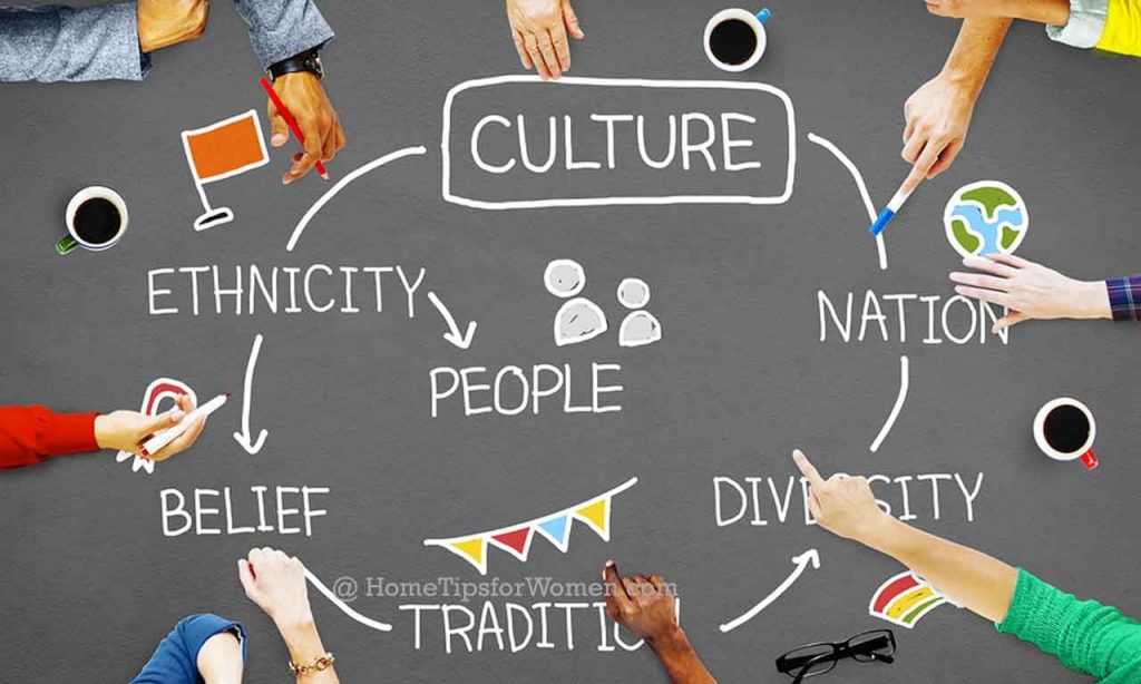
It’s crucial to recognize that the psychological impact of colors is not universally consistent and can vary significantly across cultures and contexts. For example, while red symbolizes love and luck in Western cultures, it can signify danger or caution in some Asian cultures. Additionally, personal experiences and individual preferences can also influence how people perceive colors.
The context in which colors are used is another essential factor to consider. While a bright and bold color scheme may effectively promote a summer sale, it might not be suitable for a serious medical brochure. Marketers must weigh both cultural nuances and the specific context of their campaigns when selecting colors.
The Intricacies of Color Combinations and Consistency
In print marketing, the selection of colors isn’t just about individual hues but also about how they interact when combined. Achieving color harmony is essential for creating visually appealing and effective marketing materials. Various color schemes, including complementary colors, analogous colors, and monochromatic schemes, can be strategically employed to create contrast, harmony, or emphasis as needed.
Consistency in color usage is another critical aspect of successful branding. Establishing a consistent color palette across all marketing materials, from brochures to business cards to websites, reinforces brand identity and enhances memorability for consumers. Recognizable examples include the golden arches of McDonald’s or the iconic green logo of Starbucks.
Testing and Adaptation: The Key to Long-Term Success
Understanding the psychology of color in print marketing isn’t a one-size-fits-all concept. What works exceptionally well for one brand or campaign may not yield the same results for another. Consequently, marketers must conduct A/B testing and gather feedback from their target audience to evaluate the effectiveness of color choices.
A/B testing involves creating two versions of a marketing material, each with
a different color scheme, and then measuring which one performs better in terms of engagement, click-through rates, or conversion rates. This data-driven approach enables marketers to make informed decisions about color selection and continually refine their strategies.
In addition to A/B testing, soliciting feedback from focus groups or conducting surveys can provide valuable insights into how consumers perceive and respond to color choices in print marketing. Such feedback helps fine-tune color strategies to align with the preferences and expectations of the target audience.
Cross-Cultural Considerations: Navigating Global Marketing
Expanding on the topic of cultural considerations, it’s vital to delve deeper into how different cultures perceive and respond to colors in print marketing. Understanding these nuances is the key to success in global marketing campaigns.
For example, while red may signify love and passion in many Western cultures, it holds different connotations in various parts of the world. In China, red is associated with good luck and celebration, making it a popular choice for marketing during the Lunar New Year. In contrast, in some Middle Eastern countries, red can symbolize danger or caution. Therefore, a universal approach to color selection may not always yield the desired results in a global context.
Color Preferences and Gender: Exploring Variations
Studies have revealed that color preferences can also be influenced by gender, although these preferences are not universally consistent and can vary widely among individuals. However, certain trends have emerged. For instance, many women tend to favor softer and more pastel colors, while men may lean toward bolder and more saturated hues.
When marketers target specific gender demographics, they should consider these preferences when designing print materials. Nevertheless, it’s crucial to remember that these are general trends and should not be overgeneralized or rigidly applied to all individuals.
The Strategic Role of Color in Branding
A brand’s color scheme is a fundamental component of its identity. It is often one of the first things consumers associate with a brand. Consider some iconic examples: the vibrant red of Coca-Cola, the soothing blue of Facebook, or the playful multicolor logo of Google. These color choices are not arbitrary; they are carefully selected to convey specific brand attributes and values.
During the brand development process, marketers must consider how the chosen colors align with the brand’s personality and messaging. For instance, a health and wellness brand may opt for calming greens and blues to convey a sense of well-being and trust. Conversely, a tech startup aiming to disrupt the industry may choose bold and futuristic colors to symbolize innovation.
The Power of Color Consistency in Branding
Consistency in color usage is fundamental for building and maintaining brand recognition. When consumers consistently encounter the same colors associated with a brand, it reinforces brand identity and makes it more memorable. Think of McDonald’s golden arches or Starbucks’ iconic green logo; these colors have become synonymous with their respective brands.
For print marketing materials, such as brochures, business cards, and product packaging, it’s imperative to adhere to the established color palette. Even subtle variations in color can dilute the brand’s identity and confuse consumers. Maintaining color consistency across all touchpoints reinforces brand recognition and builds trust with consumers.
Exploring Color Beyond the Visual: Multisensory Branding
While the visual impact of color in print marketing is undeniable, brands are increasingly exploring the multisensory aspects of color. Beyond what meets the eye, color can also influence other senses, such as taste, touch, and smell. For example, a red-colored beverage label may not only visually appeal to consumers but also create expectations of a sweet and fruity taste.
In the realm of fragrance marketing, colors are often used to convey specific scent characteristics. Warm and spicy fragrances may be associated with warm colors like red and orange, while fresh and clean scents align with cooler colors like blue and green. Understanding the multisensory aspects of color can provide brands with a unique opportunity to create holistic and memorable experiences for consumers.
The Influence of Color on Packaging
Product packaging is a critical touchpoint where color plays a pivotal role. The packaging color can significantly impact consumer perceptions and purchase decisions. For example, food products packaged in green containers may be perceived as healthier or more environmentally friendly, while products in red packaging may be associated with indulgence and excitement.
Furthermore, packaging color can convey product attributes such as freshness, quality, and premiumness. A well-chosen packaging color can instantly communicate the essence of a product and attract the attention of potential buyers.
The Role of Color in Typography
In print marketing, color extends beyond the visual elements of images and graphics; it also plays a crucial role in typography. The choice of text color can influence readability, emotional impact, and information hierarchy.
For instance, headlines and important information are often presented in bold and contrasting colors to grab the reader’s attention. On the other hand, body text is typically set in a neutral color that enhances readability.
Additionally, color can be used to convey emotional nuances in text. A warm and inviting color for call-to-action buttons can encourage interaction, while a subtle color for disclaimers can maintain transparency without distracting from the main message.
Color Trends and Contemporary Branding
In the fast-paced world of marketing, staying current with color trends is essential for maintaining relevance and appeal to consumers. Color trends evolve over time, reflecting changes in culture, technology, and consumer preferences. Staying attuned to these trends can help brands adapt and connect with their audience effectively.
One notable trend in recent years is the shift toward environmentally conscious colors. As sustainability becomes a central concern for consumers, shades of green and earthy tones are gaining prominence in branding. These colors convey a commitment to environmental responsibility and resonate with eco-conscious consumers.
Moreover, the use of gradients and color transitions has become a prevalent design trend. Gradients can add depth and dimension to marketing materials, creating a visually engaging experience. They are particularly popular in digital and web design, where they can create dynamic and immersive visuals.
The Impact of Color on Print Mediums
The choice of colors in print marketing is not limited to digital screens and online platforms; it extends to various print mediums. Each medium offers unique opportunities and challenges for color usage:
- Brochures: Brochures often serve as comprehensive marketing materials that provide detailed information about products or services. When selecting colors for brochures, it’s essential to strike a balance between visually appealing design and readability. Effective use of colors can guide the reader’s eye through the content and emphasize key information.
- Business Cards: Business cards are compact but powerful brand representatives. The color palette used on business cards should align with the brand’s identity and convey professionalism and reliability. Unique colors or color combinations can help the card stand out while remaining consistent with the overall branding.
- Posters and Banners: Large-format print materials, such as posters and banners, offer ample space for bold and attention-grabbing color schemes. These materials are often used for events, promotions, or advertising campaigns and should make a strong visual impact. Vibrant colors and high contrast are commonly used to ensure visibility from a distance.
- Packaging: Product packaging is a critical touchpoint where color plays a pivotal role. The packaging color can significantly impact consumer perceptions and purchase decisions. For example, food products packaged in green containers may be perceived as healthier or more environmentally friendly, while products in red packaging may be associated with indulgence and excitement.
The Role of Color in Cross-Media Marketing Campaigns
In today’s omnichannel marketing landscape, consistency across various media is essential for
building a strong brand identity. Brands should carefully consider how color choices translate across print materials, digital platforms, social media, and physical spaces.
Consistency in color usage reinforces brand recognition and builds trust with consumers. For example, if a brand’s logo features a specific shade of blue, that same shade should be consistently used across all marketing materials and digital platforms. This uniformity helps consumers instantly identify and connect with the brand, regardless of where they encounter it.
The Future of Color in Print Marketing
As technology continues to advance, the future of color in print marketing holds exciting possibilities. Emerging technologies like augmented reality (AR) and virtual reality (VR) can enhance the multisensory experience of print materials. Imagine a printed catalog that, when viewed through a mobile app, allows consumers to interact with 3D product models in their chosen colors or explore color variations in real time.
Furthermore, advances in color management and printing technologies enable greater color accuracy and consistency, ensuring that brands can maintain their intended color palette across various mediums and devices.
Mastering the Art and Science of Color in Print Marketing**
The psychology of color in print marketing is a dynamic and multifaceted field that blends artistry with scientific understanding. It’s a realm where the careful selection of colors can trigger emotions, convey messages, and drive consumer behavior.
Understanding the psychological impact of colors, considering cultural and contextual factors, and maintaining consistency in color usage are fundamental principles that marketers must embrace. Moreover, staying attuned to color trends and exploring new possibilities offered by technology can set brands apart in an increasingly competitive landscape.
The power of color in print marketing extends beyond aesthetics; it’s a strategic tool that can help brands create lasting impressions, connect with their target audience, and ultimately drive success in a dynamic and ever-evolving marketing environment. Whether in brochures, business cards, posters, packaging, or digital media, the art and science of color continue to shape the way consumers perceive and engage with brands.